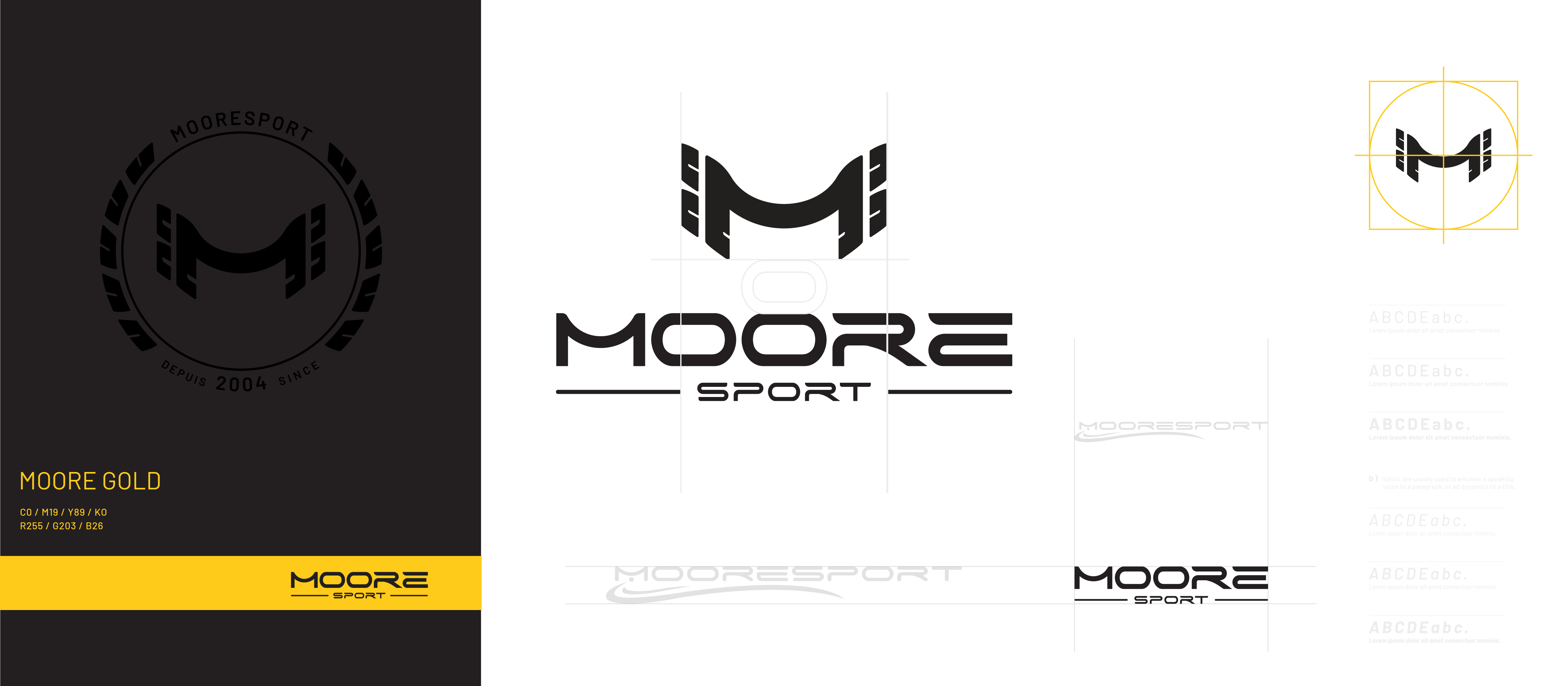
In 2023, MooreSport undertook a significant project: redesigning its iconic logo. The objective was to refresh the older logo while retaining elements that made it recognizable and impactful. This case study explores the redesign process and the rationale behind the changes.
Objectives and Rationale
The primary goals of the logo redesign were:
- Visibility: Enhance visibility when used in small areas or on fast-moving race cars.
- Recognition: Retain recognizable elements from the older logo, such as the curve in the “M.”
- Modernization: Update the font and text layout to reflect a more modern and dynamic image.
The Main Logo
The main MooreSport logo was simplified and stylized. By streamlining the design, the new logo improves visibility from a distance, ensuring it remains clear and distinct even at high speeds. The updated font and text layout contribute to this clarity, making the logo more legible and impactful.
The Icon
A new standalone icon was also introduced, encapsulating several key references:
- The “M” for MooreSport: The central feature of the icon.
- Tire Tracks that Resemble Wings: Symbolizing speed, agility, and superior handling.
This icon is designed to center easily in both circular and square formats, offering versatility in various applications.
Color Scheme
Previously, the main color for MooreSport was red. In the redesign, this was changed to a golden yellow. This decision was influenced by two factors:
- Product Consistency: Many MooreSport parts are gold, making the golden yellow color a natural fit.
- Symbolism: The golden yellow evokes the image of a gold medal, synonymous with first place and excellence.
The MooreSport logo redesign was a strategic move to ensure the brand remains relevant, recognizable, and resonant with its audience. By focusing on visibility, recognition, and modern aesthetics, the new logo reflects MooreSport’s commitment to innovation and excellence in the motorsport industry.

